Vesuvio

OVERVIEW

Vesuvio is the sister brand of La Masseria, created as a fresh take on premium Neapolitan pizza. Working closely with the founder, I helped shape a new identity that balances tradition with a younger, more contemporary spirit, while celebrating craftsmanship and the freshness of its ingredients.

YEAR

2026

ROLE

Art Direction

Illustration

SERVICES

Brand Identity Design

Art Direction

Logo Design

Merch Design

Packaging Design

Illustration


About the project

The identity was designed to feel familiar yet clearly its own. We preserved selected elements from La Masseria, including parts of the typographic and illustration language, while building a new visual system around Vesuvio’s own story and personality.

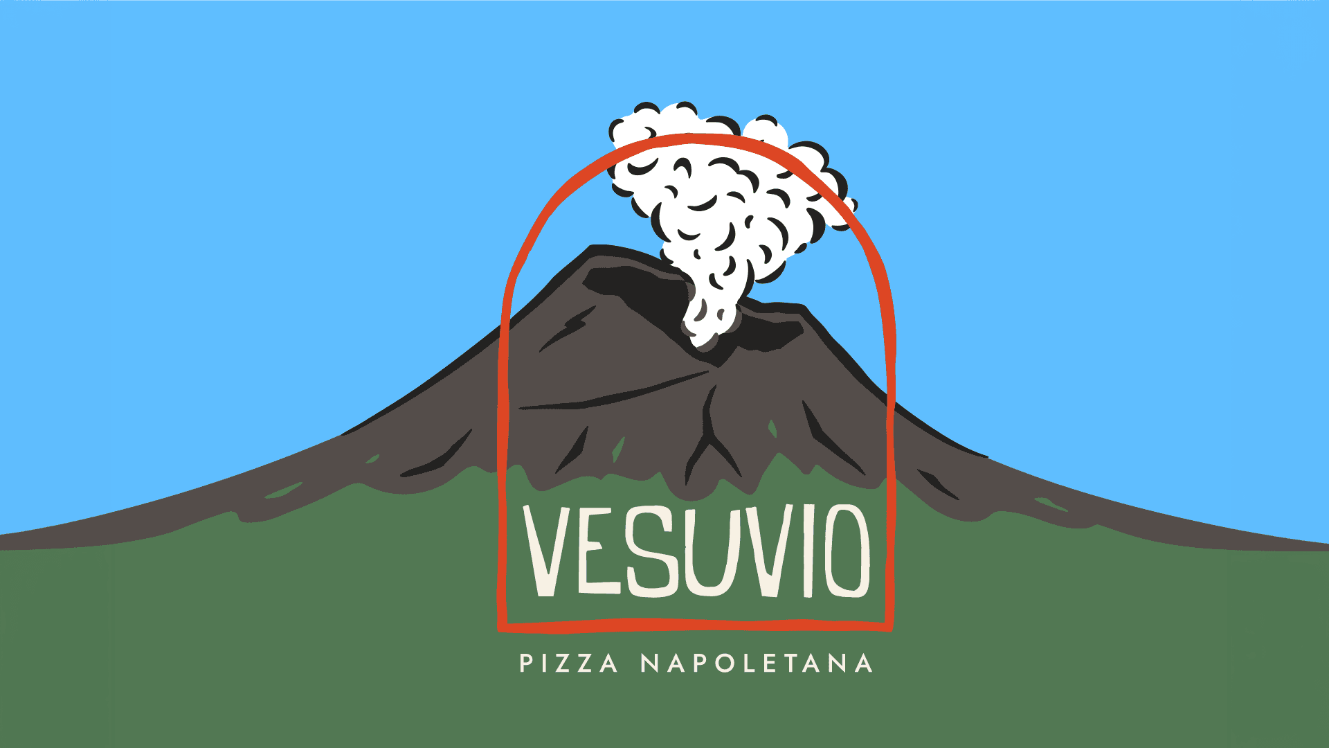
At the center of the identity is the arch: a bridge between past and present, a reference to the historic views of Mount Vesuvius framed by the architecture of Pompeii, and at the same time a symbol of the pizza oven itself, the doorway where fire, craft and ritual come together. The illustrated volcano and rising smoke reinforce the idea of a living kitchen, always fired up and making pizza by hand.

The illustration style draws inspiration from mid-century Italian travel posters, using simplified forms, flat colors and strong contrasts to create a visual language that feels nostalgic but still contemporary. I expanded this system across packaging, menus, staff uniforms and merchandise, including T-shirts, tote bags, pins and stickers.

Vesuvio

OVERVIEW

Vesuvio is the sister brand of La Masseria, created as a fresh take on premium Neapolitan pizza. Working closely with the founder, I helped shape a new identity that balances tradition with a younger, more contemporary spirit, while celebrating craftsmanship and the freshness of its ingredients.

YEAR

2026

ROLE

Art Direction

Illustration

SERVICES

Brand Identity Design

Art Direction

Logo Design

Merch Design

Packaging Design

Illustration


About the project

The identity was designed to feel familiar yet clearly its own. We preserved selected elements from La Masseria, including parts of the typographic and illustration language, while building a new visual system around Vesuvio’s own story and personality.

At the center of the identity is the arch: a bridge between past and present, a reference to the historic views of Mount Vesuvius framed by the architecture of Pompeii, and at the same time a symbol of the pizza oven itself, the doorway where fire, craft and ritual come together. The illustrated volcano and rising smoke reinforce the idea of a living kitchen, always fired up and making pizza by hand.

The illustration style draws inspiration from mid-century Italian travel posters, using simplified forms, flat colors and strong contrasts to create a visual language that feels nostalgic but still contemporary. I expanded this system across packaging, menus, staff uniforms and merchandise, including T-shirts, tote bags, pins and stickers.

Vesuvio

OVERVIEW

Vesuvio is the sister brand of La Masseria, created as a fresh take on premium Neapolitan pizza. Working closely with the founder, I helped shape a new identity that balances tradition with a younger, more contemporary spirit, while celebrating craftsmanship and the freshness of its ingredients.

YEAR

2026

ROLE

Art Direction

Illustration

SERVICES

Brand Identity Design

Art Direction

Logo Design

Merch Design

Packaging Design

Illustration


About the project

The identity was designed to feel familiar yet clearly its own. We preserved selected elements from La Masseria, including parts of the typographic and illustration language, while building a new visual system around Vesuvio’s own story and personality.

At the center of the identity is the arch: a bridge between past and present, a reference to the historic views of Mount Vesuvius framed by the architecture of Pompeii, and at the same time a symbol of the pizza oven itself, the doorway where fire, craft and ritual come together. The illustrated volcano and rising smoke reinforce the idea of a living kitchen, always fired up and making pizza by hand.

The illustration style draws inspiration from mid-century Italian travel posters, using simplified forms, flat colors and strong contrasts to create a visual language that feels nostalgic but still contemporary. I expanded this system across packaging, menus, staff uniforms and merchandise, including T-shirts, tote bags, pins and stickers.

Let’s make something worth remembering.
HELLO@TEPPEIMISUE.COM

Buenos Aires

4:35:24 AM

Foggy
Going to sleep

Let’s make something worth remembering.
HELLO@TEPPEIMISUE.COM

Buenos Aires

4:35:24 AM

Foggy
Going to sleep

Let’s make something worth remembering.
HELLO@TEPPEIMISUE.COM

Buenos Aires

4:35:24 AM

Foggy
Going to sleep